Case Study

Real-Time Conflict
News on a
Living Map.

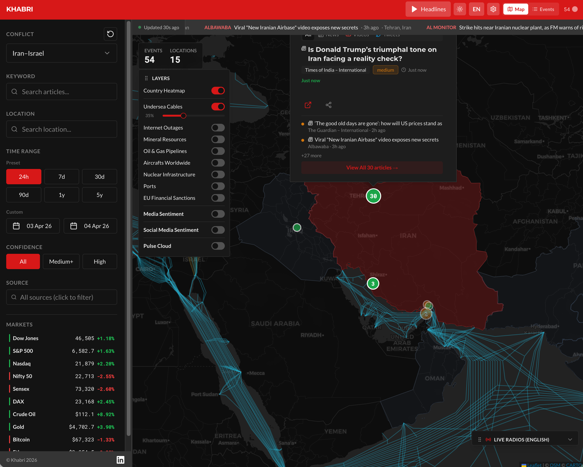
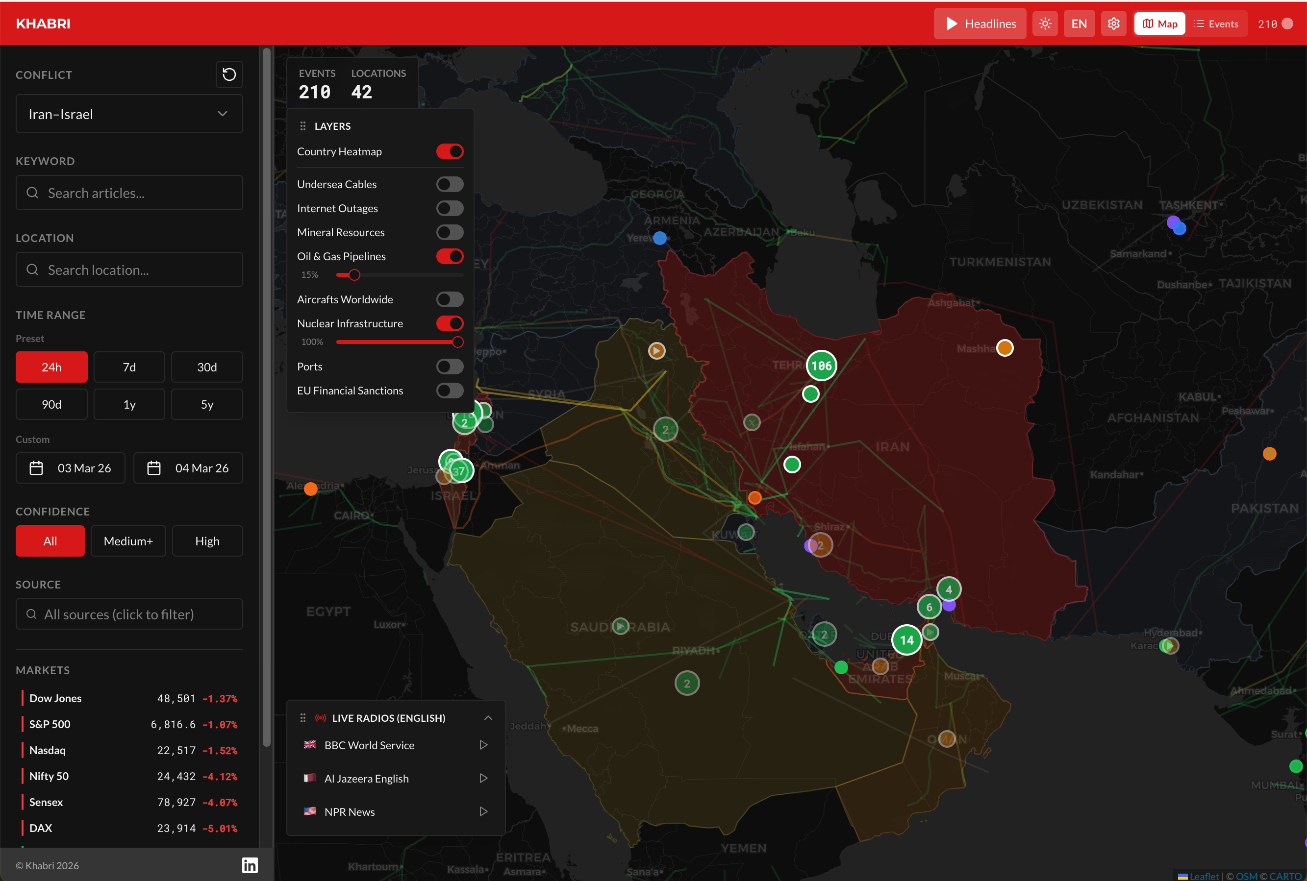
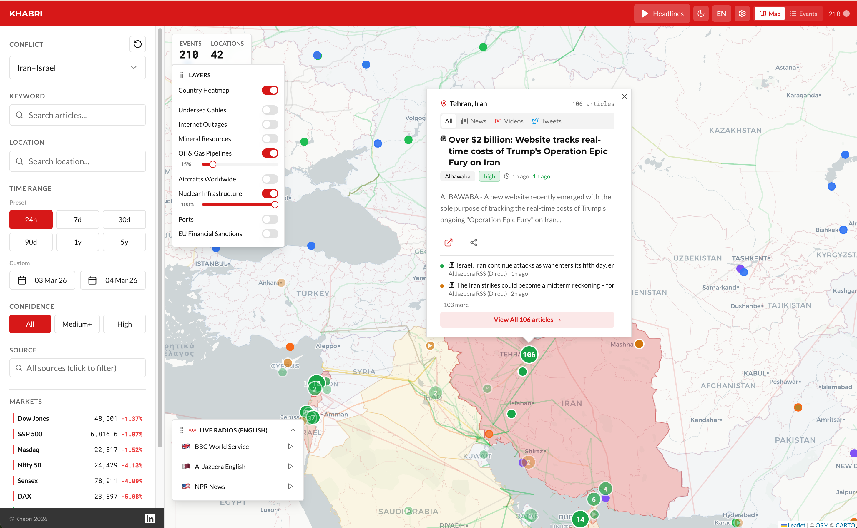
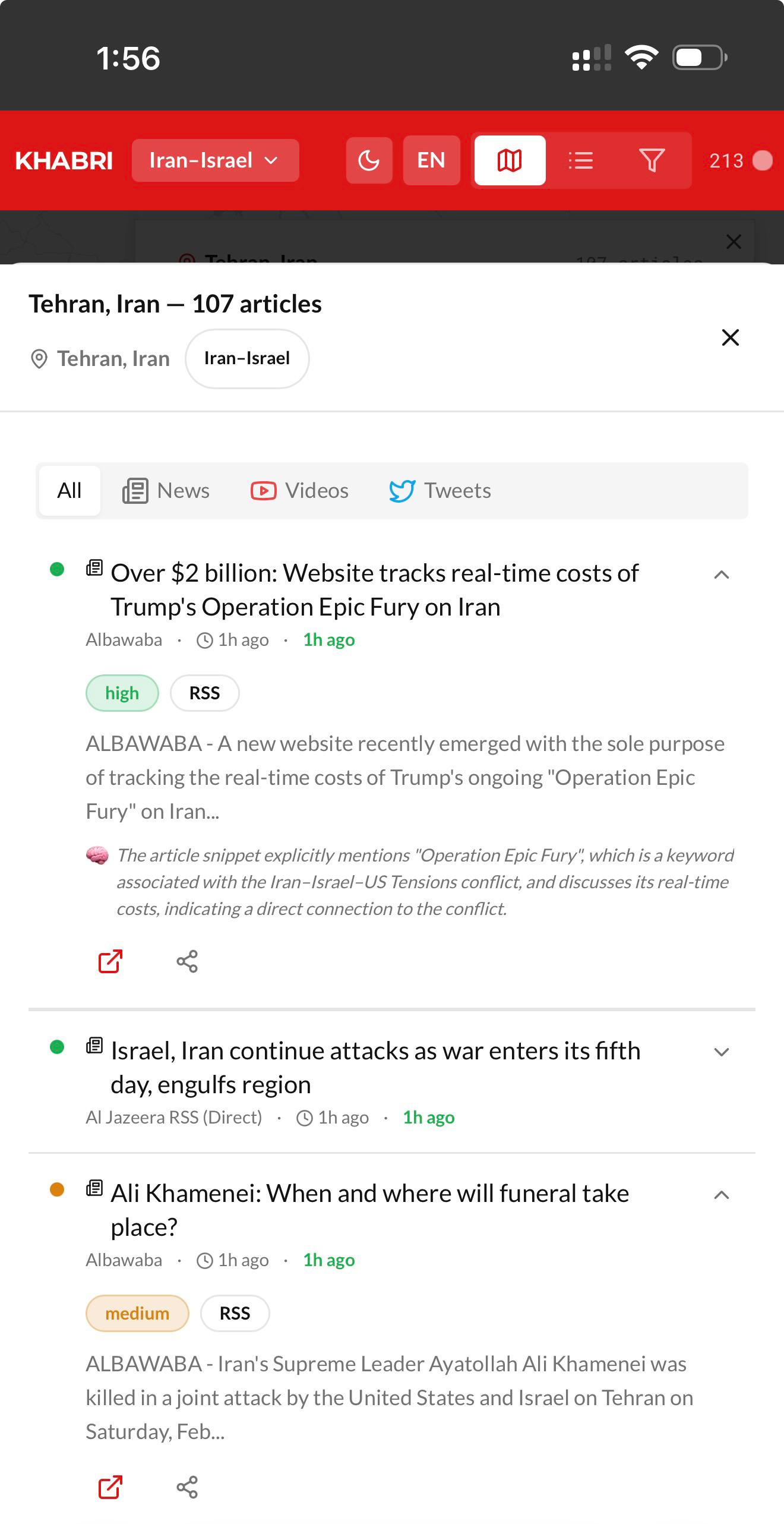
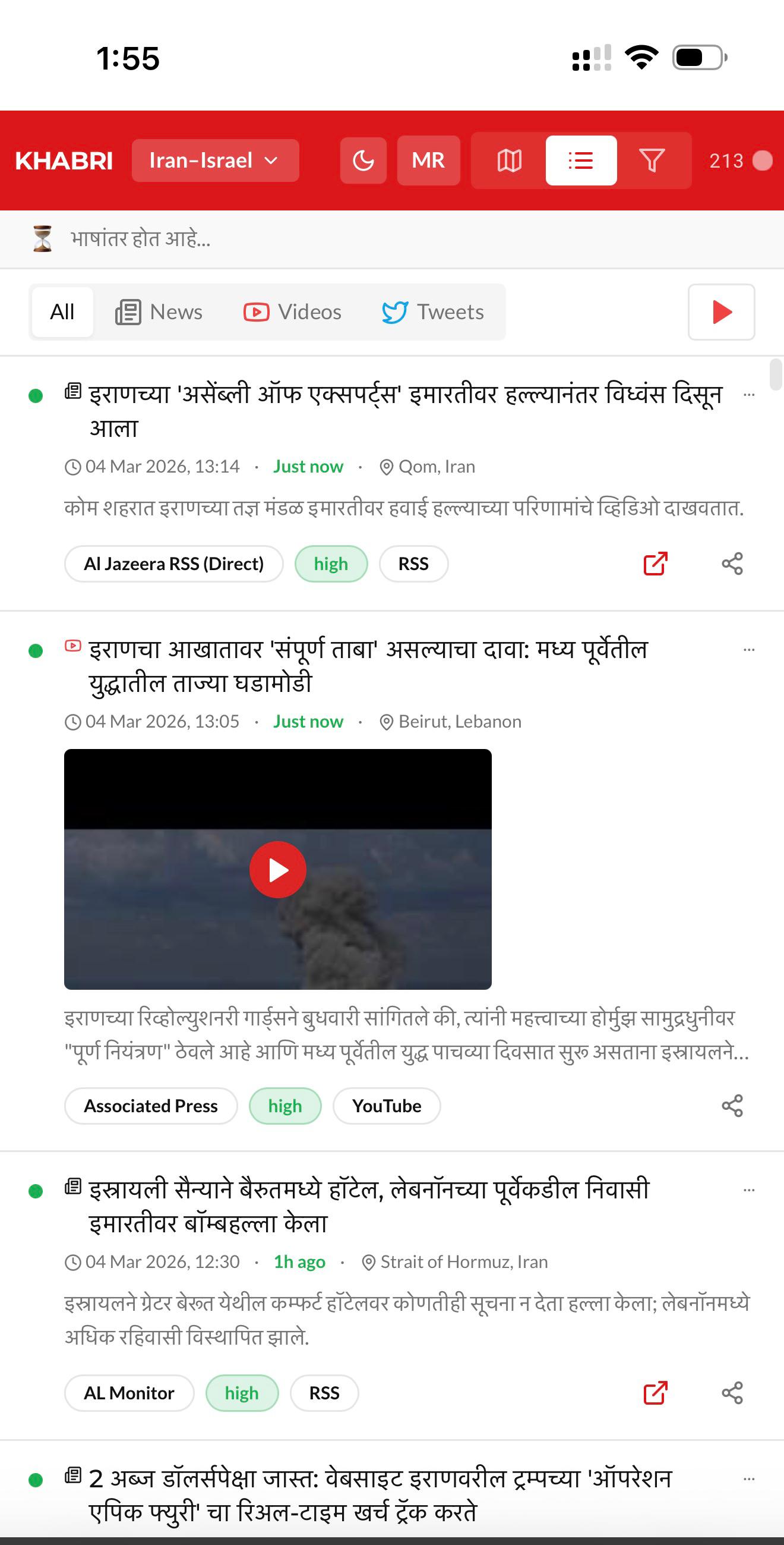
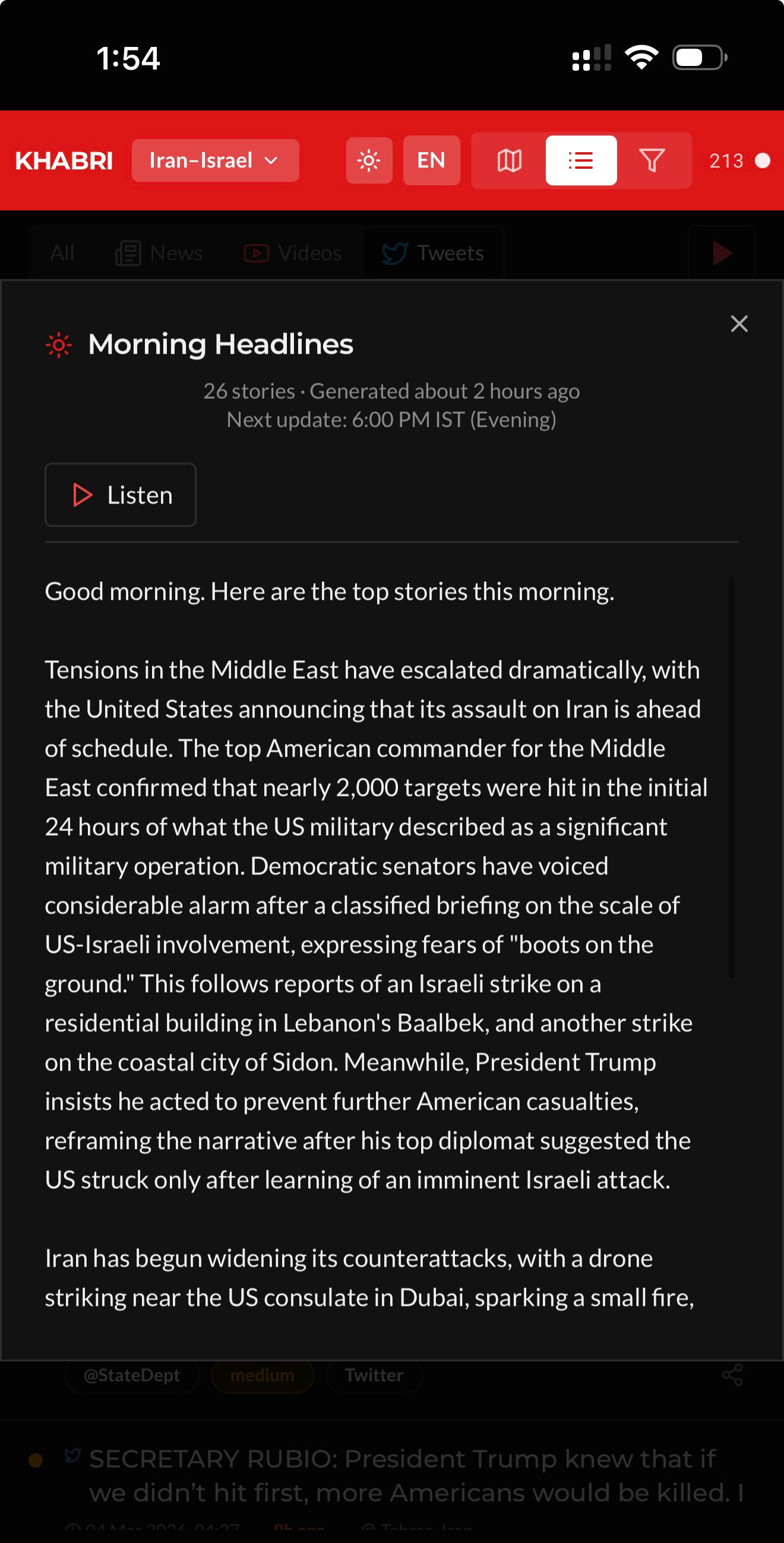
Designing and building Khabri — an AI-powered conflict news intelligence platform that aggregates articles, videos, and tweets onto an interactive geospatial map with multilingual translation and audio headlines.

AI / Machine Learning Geospatial Intelligence Real-Time Monitoring Full-Stack
11+
Map Overlay Layers
10
Indian Languages
Customizable Content Sources
Khabri platform showing interactive conflict map with article popup, geocoded markers, and location intelligence
11+
Map Layers
20+
Edge Functions
10
Languages Supported
2x
Daily AI Headlines
The Context

Making Sense of Conflict in Real Time

In a world where conflict news is scattered across dozens of sources, languages, and platforms, Khabri brings it all together on a single, living map.

Conflict news moves fast. Articles from RSS feeds, YouTube videos from war correspondents, tweets from state departments and journalists — all publish simultaneously across dozens of sources with no unified view. Analysts, journalists, and researchers are forced to manually track multiple sites, cross-reference locations, and assess relevance — often missing critical developments because they're buried in noise.

Khabri was built to solve this. A real-time conflict news intelligence platform that aggregates content from multiple source types, enriches each article with AI-powered relevance scoring and geocoding, and visualises everything on an interactive map. The name "Khabri" means "informer" in Hindi — and that's exactly what the platform does: it brings the news to you, placed exactly where it happened, scored by how much it matters.

I designed and built the entire platform end-to-end — from the React frontend with Leaflet maps to the Supabase backend with 20+ Edge Functions handling ingestion, AI enrichment, translation, and audio generation. Every line of code, every design decision, every pipeline — built solo.

Built by
Solo — Concept · Design · Code
Product
Khabri — Conflict News Intelligence Platform
Scope
End-to-end: UX, Frontend, Backend, AI Pipeline, DevOps
Built By
Solo — designed, architected, and coded entirely by me
Domain
AI / OSINT / Geospatial Intelligence / News Aggregation
Live
Stack
Lovable (React + TypeScript) + Supabase + Leaflet + Gemini AI + Eleven Labs
Timeline
2025 — Present (Live & Actively Maintained)
The Challenge

Information Overload Meets Geographic Chaos

Conflict news comes from everywhere, in every format, with no spatial context — and most of it is noise.

The core problem was threefold. First, conflict news is scattered across RSS feeds, YouTube channels, Twitter/X accounts, and news APIs — with no unified aggregation point. Second, most articles lack precise geographic coordinates, making spatial analysis impossible. Third, the signal-to-noise ratio is brutal: for every article directly about a conflict, there are dozens that merely mention it tangentially.

Building a useful intelligence tool meant solving all three problems simultaneously: aggregate from multiple source types, extract and geocode locations using AI, and score each article's relevance so that analysts see what matters first. On top of that, the platform needed to serve a multilingual Indian audience across 10 languages — and deliver twice-daily audio news bulletins generated entirely by AI.

And the entire thing had to be built, maintained, and operated by a single person. No backend team. No ML engineers. No dedicated DevOps. Just one builder with a clear vision for what conflict intelligence should look like.

Research & Discovery

Understanding the Intelligence Landscape

Studying how analysts, journalists, and researchers actually consume conflict news — and where every existing tool falls short.

Location Is the Missing Dimension
Existing news aggregators treat articles as a flat timeline. But conflict news is inherently spatial — where something happens is as important as what happened. Without a map, analysts lose the geographic relationships that reveal patterns.
Relevance Scoring Is Manual and Slow
Analysts spend hours filtering irrelevant articles. An article mentioning "Iran" in passing about oil prices shouldn't rank alongside one reporting direct military action. AI-powered scoring with a structured rubric could eliminate 70% of manual triage.
Language Barriers Lock Out Millions
Conflict news is predominantly in English, but India's population reads in Hindi, Tamil, Telugu, Bengali, Marathi, and more. On-demand translation of article content — not just UI labels — could open intelligence to a vastly wider audience.
Context Layers Change Everything
A military strike near a nuclear facility means something different from one near an empty desert. Overlaying infrastructure data — submarine cables, oil pipelines, nuclear plants, ports, shipping lanes — transforms a news map into an intelligence platform.
Strategic Decisions

Five Bets That Shaped Khabri

The architecture and design decisions that turned a news aggregator into an intelligence platform.

Decision 01
Maps First for Desktop, Feed First for Mobile
On desktop, the default view is an interactive map — every article geocoded and placed as a clustered marker colour-coded by confidence (green for high, amber for medium, red for low). The spatial layout reveals patterns a timeline never could. On mobile, users land on a scrollable feed optimised for quick scanning and one-handed use, with the map always a tap away.
Chose: Adaptive Primary UI Over: One-Size-Fits-All Layout
Decision 02
AI Enrichment Pipeline, Not Manual Curation
Every ingested article passes through a three-step AI pipeline: location extraction (Gemini identifies the most specific city), geocoding (Nominatim converts to lat/lng), and relevance scoring (structured rubric with hard caps for tangential mentions). This runs automatically every 5 minutes — zero human curation needed.
Built: Automated AI Pipeline Over: Manual Tagging
Decision 03
Multi-Source Ingestion Architecture
Built separate ingestion pipelines for RSS feeds, NewsAPI, YouTube Data API, and Twitter/X API — each with its own parsing logic, deduplication, and scheduling (30min for articles, 60min for YouTube, 15min for tweets). A unified article schema means all content types render identically on the map and in the list view.
Built: 4 Parallel Pipelines
Decision 04
Contextual Intelligence Layers
11+ toggleable map overlays transform raw news into geopolitical intelligence: country choropleth by article density, submarine cables, oil and gas pipelines, nuclear infrastructure, ports, live aircraft tracking (ADS-B/OpenSky), FAA flight delays, internet outages (Cloudflare), mineral resources (USGS), EU sanctions data, and ship traffic (AIS).
Built: 11+ Data Layers
Decision 05
Multilingual Translation + AI Audio Headlines
On-demand translation of article content (not just UI labels) into 10 Indian languages via Gemini, with an intelligent batching system that debounces requests and caches results. Twice-daily AI-generated news bulletins (morning and evening editions) with ElevenLabs text-to-speech — turning the platform into a news radio station that writes and narrates itself.
Built: 10-Language Translation + AI Audio
The Solution

A Living Intelligence Map

The key surfaces and features I designed and built across Khabri's end-user and admin experiences.

Surface 01

Interactive Map — See the World in Real Time

The centerpiece of Khabri is a full-screen Leaflet map with OpenStreetMap and CARTO basemaps (theme-aware dark/light). Articles render as clustered markers colour-coded by AI confidence score — green for high relevance, amber for medium, red for low. Clicking a cluster expands to individual articles; clicking a marker opens a popup with the article title, snippet, source, timestamp, and AI reasoning. Users can filter by conflict, time range, confidence level, source, content type, and keyword — all in real time.

The left sidebar provides conflict selection, keyword and location search, time range presets (1h to 30d plus custom date pickers), confidence toggles, source filters, and a live market ticker. A timeline slider lets users animate news across time, watching how a conflict develops hour by hour.

Khabri dark mode map view showing Iran-Israel conflict with clustered markers, map layers panel (submarine cables, oil pipelines, nuclear infrastructure), market ticker, and live radio stations
Desktop — Dark mode with intelligence overlay layers, market ticker, and live radio
Khabri light mode map showing article popup with title, snippet, source, timestamp, confidence indicators, and related articles for Tehran location
Desktop — Light mode with article popup showing AI scoring and related articles
Surface 02

Mobile — News List, Translation & Headlines

On mobile, Khabri adapts to a list-first experience with the map accessible via a toggle. The event list shows each article as an expandable card with confidence badge, content-type icon, translated title, age, location, AI reasoning, and source badges. Users can filter by content type (All, News, Videos, Tweets) and play audio headlines directly from the top bar.

The translation system supports 10 Indian languages including Hindi, Tamil, Telugu, Bengali, Marathi, Kannada, Malayalam, Gujarati, Punjabi, and Odia — translating article content on-demand, not just UI labels. The AI-generated morning and evening headline bulletins can be listened to with play/pause/seek controls, turning Khabri into a personal news radio.

Khabri mobile list view in English showing articles filtered by location with confidence badges, source tags, and expandable AI reasoning
Mobile — English list view with filters
Khabri mobile list view translated to Marathi showing articles, YouTube videos, and source badges in Devanagari script
Mobile — Marathi translation (1 of 10 languages)
Khabri mobile AI-generated morning headlines with play/listen button, showing broadcast-style news bulletin text
Mobile — AI morning headlines with audio
Surface 03

Social Integration — Twitter/X, YouTube & RSS

Khabri doesn't just aggregate articles — it pulls in tweets from official government accounts and journalists, YouTube videos from war correspondents and news channels, and RSS feeds from major outlets. Each content type has its own visual treatment: tweets show embedded previews with profile images, YouTube cards display video thumbnails with play buttons, and RSS articles show standard news card layouts.

The content type filter (All / News / Videos / Tweets) lets users focus on exactly the format they need. The multi-source approach ensures that breaking news from Twitter, in-depth analysis from news outlets, and on-the-ground footage from YouTube all appear in one unified view — geocoded and scored by the same AI pipeline.

Surface 04

Admin Dashboard — Pipeline Control Centre

The admin dashboard provides full control over Khabri's data pipeline. Source management with CRUD operations for RSS, NewsAPI, YouTube, and Twitter sources — each linkable to multiple conflicts. A conflict keyword editor with AI-powered keyword suggestions (Gemini analyses recent articles and recommends new tracking terms). Server-side paginated article management with bulk operations, inline AI reasoning display, and single-article re-enrichment.

Pipeline controls let admins trigger ingestion, scoring, enrichment, and geocoding runs manually, with real-time progress tracking via Supabase Realtime subscriptions. Cron status monitoring, enrichment history, and pipeline logs provide full operational visibility into the automated systems that keep Khabri running 24/7.

Governing Principles

Four Rules for Every Screen

These principles governed every design and engineering decision on Khabri — from map interactions to pipeline architecture.

01
Geography Is the Primary Axis
Every piece of content must have a location. The map is the default view, not an afterthought. Spatial context reveals patterns that chronological feeds hide — cluster density shows hotspots, geographic spread shows escalation.
02
Signal Over Noise
AI scoring isn't optional — it's the foundation. Every article gets a structured relevance score with transparent reasoning. Low-relevance content is auto-hidden. Users see what matters first, always.
03
Language Should Never Be a Barrier
Translation happens at the content level, not just the UI level. Article titles, snippets, and AI reasoning are translated on-demand into 10 Indian languages — making intelligence accessible to 1.4 billion people.
04
Automate Everything, Control Everything
Cron jobs handle ingestion, enrichment, and headline generation automatically. But every automated process has a manual override, progress tracking, and cancellation support. The system runs itself — but the operator is always in command.
Architecture

The Tech Behind the Map

A modern, serverless architecture built for real-time intelligence at scale — designed and implemented entirely by a single developer.

Frontend
React + TypeScript
Component-driven UI with Leaflet maps, theme-aware rendering, and responsive mobile-first design.
Maps
Leaflet + OpenStreetMap
Interactive mapping with marker clustering, custom popups, and 11+ toggleable data overlay layers.
Backend
Supabase (PostgreSQL)
Managed database with Row Level Security, Realtime subscriptions, and pg_cron for scheduled jobs.
Serverless
20+ Edge Functions
Deno-based functions for ingestion, enrichment, scoring, translation, headlines, and proxy APIs.
AI / ML
Gemini (Google AI)
Location extraction, relevance scoring with structured tool calling, translation, keyword suggestions, and headline generation.
Voice
ElevenLabs TTS
Text-to-speech for twice-daily AI-generated audio news bulletins with base64 encoding and in-app playback.
Data Sources
NewsAPI + YouTube + Twitter
Four parallel ingestion pipelines with OAuth, deduplication, conflict keyword matching, and English language detection.
Geocoding
Nominatim (OpenStreetMap)
AI-assisted location disambiguation followed by geocoding with rate limiting and fallback strategies.
Live Data
ADS-B, AIS, Cloudflare, FAA
Real-time aircraft tracking, ship traffic, internet outage monitoring, and flight delay data via proxy functions.
Impact & Results

Built Solo. Runs 24/7. Serves the World.

Khabri demonstrates that a single designer-developer can build and operate a production-grade AI intelligence platform.

11+
Intelligence overlay layers including submarine cables, nuclear plants, pipelines, ports, and live aircraft
10
Indian languages supported for on-demand content translation via Gemini AI
20+
Supabase Edge Functions powering ingestion, enrichment, translation, and live data proxies
1
Solo builder — every line of code, every design decision, every pipeline built by a single person

"Khabri represents the kind of product I believe in — where design thinking meets engineering execution. It's not a mockup or a prototype. It's a live, production system that ingests thousands of articles, scores them with AI, geocodes them onto a map, translates them into 10 languages, and generates audio news bulletins — all running autonomously, 24 hours a day."

Khabri is proof that the boundaries between design and engineering are artificial. The best products emerge when one person holds the entire vision — from the user experience down to the database schema, from the map interaction patterns to the AI scoring rubric. No handoff gaps. No lost-in-translation requirements. Just a direct line from intent to implementation.

The platform is live at khabri.net and actively maintained. It continues to evolve with new conflict tracking, additional data layers, and improved AI models — a living product that grows alongside the news it monitors.

The Framework

Deep Dive Design in Action

How owning both design and engineering produced a platform that no handoff-driven process could.

Khabri is the purest expression of the Deep Dive Design philosophy — because there was no gap between designer and developer. Every UX decision was informed by technical constraints I understood intimately. Every architectural choice was shaped by the user experience I was designing. The AI scoring rubric wasn't a product requirement handed to an ML team — it was a design decision I implemented directly in the Edge Function.

This project demonstrates that the most powerful products emerge when design thinking and engineering execution live in the same mind. The map interaction patterns informed the database indexing strategy. The translation UX shaped the batching algorithm. The timeline animation drove the query optimization. Design and code weren't separate phases — they were a single, continuous act of creation.

Khabri isn't just a case study in product design. It's a case study in what happens when you remove every layer of abstraction between vision and execution.

Ishdeep.
Staff Product Manager UX · 18+ Years in Design & Product