Case Study

From "Have To"
to "Can't Live
Without."

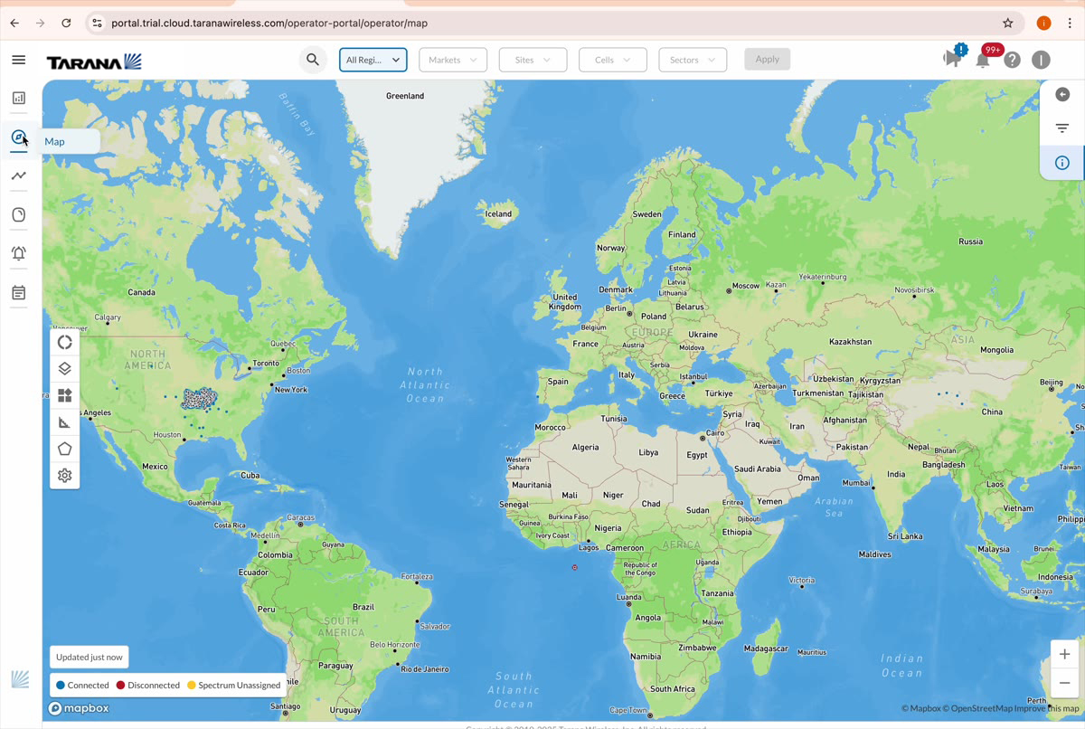
Redesigning Tarana Cloud Suite — the network management platform powering 300+ wireless operators across 24 countries.

Tarana Wireless Enterprise SaaS ngFWA / Telecom Cloud Platform
40%
Less Downtime
35%
More Efficient
300+
Operators
TCS Maps view showing Tarana network deployments across the United States with connected and disconnected nodes visualized on a Mapbox map
40%
Less Downtime
35%
Ops Efficiency
200K+
Links Managed
24
Countries
60%
Faster Prototyping
The Context

A Different Kind of Last Mile

Imagine being responsible for internet connectivity for millions of homes, and your only tools are fragmented, on-premise systems that break when you need them most.

Tarana Wireless builds next-generation fixed wireless access technology that lets ISPs deliver fiber-class broadband over radio signals — without digging up roads. Instead of months of construction, an ISP puts Tarana base nodes on towers and small remote nodes on rooftops, and delivers high-speed internet where fiber can't economically reach.

The G1 hardware is the muscle. TCS — the Tarana Cloud Suite — is the brain. A cloud-hosted platform on AWS that operators access through a browser to plan, deploy, monitor, troubleshoot, and scale their entire network from a single place.

The users aren't consumer app users. They're NOC operators watching dashboards at 3am, field technicians on rooftops in the rain, and network admins managing 40+ sites from a single screen. And they were suffering.

Role
Senior Staff Product Manager UX
Company
Tarana Wireless
Scope
End-to-end UX: TCS + Mobile App + Device UI
Team Led
11 people (designers + UI engineering)
Timeline
Multi-year (12+ quarterly releases)
Industry
Telecom / Fixed Wireless Access (ngFWA)
Reporting To
VP of Product Management
Geographies
Pune, India + San Jose, CA (HQ)
Role & Leadership

Sole UX Owner Across a Product Suite

I owned the end-to-end user experience across all of Tarana's software products — a connected system spanning cloud, mobile, and embedded surfaces.

This wasn't a single product. It was three interconnected surfaces: TCS (the cloud management platform), a Mobile Installer App for field technicians, and the Device Software UI embedded on the G1 radios themselves. Every interface had to feel consistent, purposeful, and fit for its context.

I led a team of 11 — junior designers I mentored directly, and a UI engineering team of nine whose UX execution I directed. Cross-functional work spanned backend engineers, the data team, radio and embedded systems engineers, senior management, customer success, and other PMs.

The team operated across a significant timezone gap — San Jose HQ and Pune, India — across 12+ quarterly release cycles. Twelve consecutive on-time deliveries across a distributed team working on a complex enterprise platform is a result I'm particularly proud of.

Research & Discovery

What We Learned That Changed Everything

Usability testing every 2 weeks. Quarterly interviews. Field visits every 6 months. Analytics on every release via HotJar and Heap.

Installers Are Never Alone
The assumption was that the Mobile Installer App was a solo field tool. Research revealed installers work in 2-person teams — one on the roof, one near the truck — and the NOC actively supports them throughout. The install experience is collaborative, not individual.
Operators Think in Geography, Not Hierarchy
Operators don't ask "show me Sector 4 of Site 12." They ask "what's happening near Tulsa?" Their mental model is a map, not a tree. This validated the decision to go Maps-First as the primary navigation paradigm.
The Truck Roll Is the Enemy
For WISPs, the defining business anxiety isn't speed or coverage — it's the cost of physically dispatching a technician. Every feature had to answer: does this reduce the need to send someone out?
Installers Prefer Laptops Over Phones
Despite designing a mobile app, field techs strongly preferred using a laptop during installations. Screen real estate, input precision, and diagnostic complexity made a smaller form factor inadequate.
Strategic Decisions

Four Bets That Defined TCS

The decisions where getting it wrong would have cost the platform its trajectory.

Decision 01
MUI as the Design System Foundation
Chose Material-UI over Bootstrap and Adobe Spectrum for its production-ready components, deep TypeScript support, built-in accessibility, and design token system. Defined a phased migration roadmap and ran engineering workshops that resulted in 60% faster prototyping and streamlined developer onboarding.
Chose: MUI Over: Bootstrap, Spectrum
Decision 02
Highcharts for Data Visualization
Network monitoring lives and dies by its charts. Highcharts won over amCharts with its lower learning curve, superior documentation, responsive design, and built-in export — delivering more polished, reliable output for the time-series and throughput charts operators depend on daily.
Chose: Highcharts Over: amCharts
Decision 03
Maps-First Navigation Paradigm
Made the Mapbox geospatial view the default entry point — not a supplementary feature. Research proved operators think geographically. The map reduced triage cognitive load and unlocked new business value in predictive maintenance and capacity planning.
Primary: Mapbox Maps
Decision 04
In-House Events Portal (Replacing Kibana)
The boldest bet: replacing Kibana with a purpose-built events analysis and troubleshooting portal. Kibana was generic — the Events Portal was designed around a NOC operator's mental model: correlating events to radio state changes and surfacing diagnostic context in one click.
Built: Custom Events Portal Replaced: Kibana
The Solution

Three Surfaces That Define TCS

The key features I would walk a hiring manager through first — and why each one matters.

Feature 01

Maps — Seeing the Network

The Mapbox-powered geospatial view is TCS's signature surface and most-used feature. Every base node and remote node appears on a live map, color-coded by health status. Clicking into any point surfaces performance charts, alarm history, sector details, and management actions — without losing geographic context.

For operators managing networks that span hundreds of square miles and thousands of nodes, this was transformative. Instead of navigating tables to find a problem, they could see it. The map reduced cognitive load during triage and gave operators a shared visual language for discussing their networks internally.

TCS Maps overview showing US network deployment for Wisper Internet with connected and disconnected nodes
Maps — Full network overview (US deployment)
TCS Maps drill-down showing individual base node details with device info, link metrics, and CBRS spectrum data
Maps — Device drill-down with contextual details
TCS global map view showing Tarana network deployments worldwide across multiple continents
Maps — Global deployment view showing 24-country reach
Feature 02

Events Portal — Diagnosing the Problem

The Events Portal is TCS's troubleshooting engine — built in-house to replace Kibana. It gives NOC operators the ability to correlate network events to radio state changes, link anomalies directly to time-series chart spikes, and drill from a visual alarm into a full event timeline in one click.

This isn't a log viewer. It's a diagnostic workflow built around how an operator actually thinks when something goes wrong at 3am — organized by the NOC operator's mental model, not by how a database organizes events.

TCS Events Portal showing event timeline with histogram chart and event table for troubleshooting
Events — Timeline view with event histogram
TCS Events Portal showing Insights view with stacked bar charts, event category breakdown, and donut chart for top events analysis
Events — Insights view with category breakdown
Feature 03

Device Details — Knowing the State

The device detail page is the anchor for remote troubleshooting and installation support. It gives a persistent, always-current view of any individual radio: operational status, software version, link quality, alarm history, throughput charts, and available actions.

Born from the research insight that "radio state must always be visible during troubleshooting," this page translates the operator's most fundamental anxiety — is this radio okay? — into a calm, comprehensive, always-accurate information surface.

TCS Device Details page showing base node status, KPI metrics, overview data, embedded map, and throughput charts
Device Details — Base node with KPIs and throughput
TCS Device Details for another operator showing connections tab with peak throughput and embedded map location
Device Details — Alternate operator view
TCS Dashboard overview showing connected/disconnected device counts, region selector, and trend performance charts for BN and RN devices
TCS Dashboard — Network health overview with trends and performance
Governing Principles

Four Rules for Every Decision

These principles governed every design decision on TCS — from information architecture to button placement.

01
Always Show System State
Operators can never be left guessing. Status, version, health, and last-known-good must be visible at all times, everywhere.
02
Clear Topology Navigation
The hierarchy (Operator, Site, Sector, Node) must persist across every page. Losing that thread mid-troubleshoot is disorienting and dangerous.
03
Never Block the Operator
Workflows must be non-blocking. The NOC operator at 3am cannot wait. Client-side search, sort, and pagination are non-negotiable.
04
Awareness of Scale
A single action can affect thousands of nodes. The UI must communicate scope and consequence before every consequential action.
Impact & Results

The Numbers That Prove It

Measured via operator surveys, internal telemetry, Heap analytics, and customer conversations.

40%
Reduction in network downtime via TCS monitoring and alarm management
35%
Improvement in operational efficiency for operator customer base
95%
Installer satisfaction score on Device Software UI
10K+
Monthly device authentications via Mobile Installer App
60%
Faster prototyping after MUI design system migration
30%
Reduction in device installation time
50%
Faster device commissioning through optimized workflows
300+
Operators across 24 countries and 47 US states

"The tools I saw last week really make it seem like you are making great progress in turning TCS into a tool we cannot live without."

CEO of a Major WISP in the USA
The Framework

Deep Dive Design in Action

How co-creative collaboration resolved disagreements and produced better outcomes than any top-down mandate.

Disagreements with engineering, PM, and senior leadership were a constant feature of this project — not a failure, but a natural consequence of designing complex systems under constraint. The approach that worked consistently: co-creation, not persuasion.

My Deep Dive Design Framework positions UX as a collaborative function that shifts its center of gravity depending on the phase: tightly coupled with PM while ideating, tightly coupled with PM and loosely with Engineering while designing, tightly coupled with Engineering and loosely with PM while delivering.

Rather than asserting design authority, this model invited engineering and PM into the design process at the right moments — using parallel tracks and structured co-creation sessions to build shared ownership. The result: fewer standoffs, faster convergence, and better outcomes.